Create an Accessible Exhibit Space
Exhibit Signage & Labels:
Legibility & Readability
Legibility
When it comes to visual displays, there are four main aspects to keep in mind in terms of legibility.
Typeface
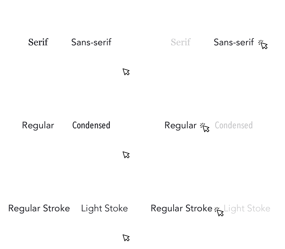
- Choose sans serif fonts such as Tahoma, Calibri, Helvetica, Arial and Verdana.
- Certain font characteristics can make text difficult to read:
- Condensed, extended or fonts with lighter weights
- Wide variation in stroke width
- Thin strokes that fade, break or disappear
- Letters and numbers that closely resemble each other
- Shapes of “d” and “a”
- Shapes of “6” and “8”
Type Style & Size
- Do not set text in all caps.
- Use only for titles and decorative headings.
- Avoid the use of script and italic type for essential information.
- If an exhibition title is presented in an ornate or decorative type, it should be repeated in a clearer type at an accessible location near the exhibition entrance.
- Provide alternative forms of labels within the exhibit space (Braille, large print, etc).
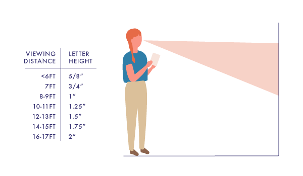
- Select type size based on viewing distance.
- Left justify the text box.
Reproduction Quality
- Diminish glare on label surfaces.
- Print only on a solid background.
- Boost the contrast between text and background.


Environmental Conditions
- Provide sufficient light of 100-300 lux.
- If this level of light is unsustainable due to an object’s sensitivity to light, allow readers to get closer to the label.
- Choose label holders that limit glare.
- Locate labels in consistent locations.
- Keep in mind the natural line of sight when mounting labels.
- Labels should be mounted between 48" and 67" from the floor with 54" being ideal.
- Mount label rails so the top is 40" above the floor.
- Define labels with color or raised surface.
Readability
One important aspect of accessible exhibition information is to ensure that labels have high readability. This means that a reader can follow and understand the words, sentences and paragraphs. It is essential to consider the content and arrangement of your labels.
Content
- Avoid the use of:
- Colloquialisms
- Complex English
- Jargon
- Technical language
- Use active voice.
- Provide a short overview paragraph at the beginning of the introductory and thematic label panels.
Arrangement
- Limit sentence and label length.
- Sentences should be 15-25 words and labels should be no more than 100 words.
- Use a line length that facilitates reading.
- 45-50 characters per line makes the text easier to read
- Provide line drawings, silhouettes and photographs to help with comprehension.

Learn more
- Smithsonian Guidelines for Accessible Exhibition Design
- ADA.gov
- National Park Service (NPS) Accessibility Guidelines
- ADA Resources for Museums, Arts and Cultural Institutions from ADA National Network
- Facilities & Risk Management Resources from American Alliance of Museums (AAM)
